


So, what colour actually goes with white? The easy answer is… well, pretty much anything. The real trick isn't finding one "perfect" match, but understanding how different colour pairings can completely change the feel and mood of your home.
Your Guide To Pairing Colours With White
Think of this as your guide to moving beyond basic colour swatches. We're going to explore how to use white as a powerful and versatile tool in your design kit.
First, we'll dive into a little secret: white itself comes in different ‘temperatures’. You’ve got cool whites, warm whites, and pure whites, and knowing the difference is the key to unlocking some truly stunning combinations. Whether you’re dreaming of a calm, minimalist sanctuary or a vibrant space bursting with personality, you’ll find the principles and inspiration you need right here.
While an all-white room has a certain timeless elegance, there's a clear trend towards pairing white with more grounding, natural tones. An analysis of the UK's most popular living room colours showed that while white is still a top choice, it's often used alongside other shades. The top companion colours are now green, grey, and blue, which have taken the top three spots, pointing to a collective desire for rooms with more depth and character.
This shift really plays to white's greatest strength: its incredible versatility. It can be the crisp, clean canvas that makes a bold colour pop, or it can be a soft, gentle partner to subtle, calming neutrals. It's all about how you balance it.
White is the ultimate design chameleon. It doesn’t just match other colours; it enhances them, making blues feel calmer, greens more vibrant, and greys more sophisticated.
For anyone planning a refresh, our guide to living room makeover ideas offers plenty more inspiration on how to use colour to transform a space.
The Secret to Working With White: It's All in the Undertones
Before you can confidently decide what colour goes with white, you first need to get to know the specific white you’re working with. It's a common mistake to think of white as just one flat colour. In reality, it's a whole family of shades, and each one has its own subtle personality, thanks to its undertones.
Getting this right is the secret to creating a space that feels truly harmonious.
These undertones generally fall into one of two camps: warm or cool. Figuring out which one your white belongs to is the essential first step in building a stunning colour palette.
Figuring Out Your White
-
Cool Whites: These are the whites with a subtle hint of blue, grey, or even a touch of violet. They feel crisp, clean, and modern – think of the bright, sharp light on a clear winter morning. Cool whites are fantastic for making a room feel larger and more open.
-
Warm Whites: These whites have a little yellow, red, or beige mixed in, giving them a creamy, soft, and inviting quality. They bring to mind the cosy glow of afternoon sunshine and are perfect for creating a welcoming, comfortable atmosphere.
There is, of course, a third type: a pure, brilliant white. This one acts as a true neutral without leaning strongly in either direction. It provides the sharpest contrast and a clean, gallery-like backdrop.
Think of it like this: knowing your white’s undertone is like knowing the key of a song before you start to play. A cool, slate grey might sound beautiful with a blue-toned white but could feel completely off-key next to a creamy, warm one.
This little bit of knowledge is your best defence against frustrating colour clashes. For instance, a sleek, modern sofa dressed in a versatile alabaster white sofa cover will look its absolute best when the colours around it complement its specific shade, creating a look that feels deliberate and pulled together.
Creating Serenity With White and Neutrals
If you're after a sophisticated look that will stand the test of time, you really can't go wrong pairing white with other neutrals. This is the cornerstone of the hugely popular ‘quiet luxury’ trend. Think soft greys, warm beiges, and earthy taupes working together to build a calm, layered space that feels effortlessly chic.
The real secret here isn't just about colour, but texture. To avoid a room that feels flat or sterile, you need to introduce a variety of finishes. Picture a space with matt white walls as the backdrop, a sofa upholstered in a nubby, tactile linen, a sleek stone coffee table, and a plush wool rug underfoot. This combination is what turns a simple room into a tranquil oasis.
This kind of neutral palette is also the perfect canvas for natural materials. Light woods, unglazed ceramics, and woven baskets all add to that sense of peace and understated elegance that so many modern UK homes are aiming for.
Pro Tip: Pairing white with neutrals is about so much more than just matching shades. The real magic happens when you layer textures. The interplay between a smooth white wall, a soft grey fabric, and a rough-hewn wooden table is what creates visual depth and that feeling of curated comfort.
The Rise of Quiet Luxury
A quick look at recent interior design trends in the UK shows that white is most often paired with muted, earthy tones. It’s all part of a bigger cultural shift towards bringing nature-inspired design into our homes. This minimalist style, often called quiet luxury, uses refined colours like almond, taupe, and cool grey against a foundational backdrop of white to create a real sense of warmth and serenity. You can find more great insights on current UK interior design trends over on restless.co.uk.
The key to getting this right is understanding the undertones of your main white. Is it a cool, crisp white or a warmer, creamier one? This will guide your choices and ensure the finished space feels cohesive.
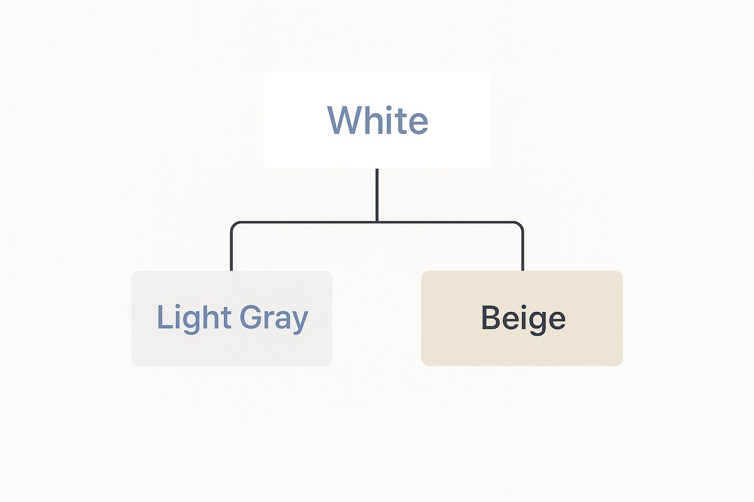
To help you get started, here’s a quick guide to pairing neutrals based on the undertone of your white.
Neutral Colour Pairings With White Undertones
| White Type | Best Neutral Pairings | Resulting Atmosphere |
|---|---|---|
| Cool White (with blue/grey undertones) | Slate Grey, Charcoal, Silver, Greige | Crisp, Modern, Sophisticated |
| Warm White (with yellow/pink undertones) | Beige, Sand, Taupe, Cream | Cosy, Inviting, Relaxed |
As you can see, a cool white works beautifully with slate greys and silver for a sharp, contemporary feel. On the other hand, a warmer white is the perfect companion for beige, sand, and taupe if you’re aiming for a space that feels more welcoming and snug.
Bringing Nature Indoors With Earthy Palettes
If you want to create a space that feels grounded and connected to the outdoors, look no further than an earthy colour scheme. This is a classic and incredibly effective approach, pairing crisp white with colours pulled straight from nature—think deep olive greens, rich terracotta, and warm, grounding browns.
This entire concept is rooted in biophilic design, which is all about strengthening our connection to the natural world through our living spaces. It's a fantastic way to foster a genuine sense of calm and well-being.
In this partnership, white acts as a clean, bright canvas. It's like a breath of fresh air that allows those organic colours to feel even more vibrant and authentic, preventing them from overwhelming the room. It’s this balance that creates a space that feels both modern and deeply restorative.
Building Your Natural Palette
Just picture it: a crisp white room with a striking feature wall painted in a muted sage green. Or maybe a warm, off-white kitchen brought to life with terracotta pots and dark wood shelving. These pairings are hugely popular in UK decor because they nail that balance between contemporary freshness and timeless, natural comfort. The best advice is always to draw inspiration directly from the world outside your window.
Alongside white, these deep, earthy tones have surged in popularity for the comforting feel they bring. Top UK home decor firms are highlighting shades like burnt sienna and warm browns as essential staple colours. They just work so beautifully with white to establish that natural harmony and a feeling of tranquillity at home. You can explore more about these trending interior design styles and see how they bring nature into the fold.
By combining the purity of white with the grounding effect of earthy tones, you create a sanctuary in your own home—a space that feels both energising and deeply calming.
To get this look right in your own space, here are a few simple combinations to get you started:
- Crisp White & Sage Green: This duo creates a light, airy, and calming atmosphere that feels incredibly fresh and modern.
- Off-White & Terracotta: Perfect for a warm, rustic, and inviting space with a hint of a Mediterranean or Southwestern vibe.
- Brilliant White & Deep Brown: For a sophisticated and grounding look that feels both organic and effortlessly luxurious.
Ultimately, this approach proves that when you're wondering what colour goes with white, looking to nature often gives you the most beautiful and enduring answers. It's how you turn your home into a proper retreat.
Here is the rewritten section, crafted to sound human-written and natural.
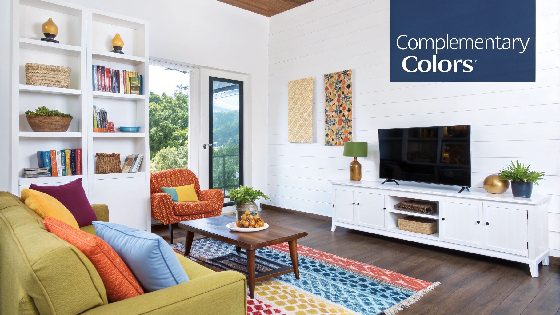
Making a Statement with Bold Colours
If you're someone who loves a bit of drama in your interiors, white is your secret weapon. It’s the perfect canvas, giving those big, vibrant colours space to breathe so they can really shine without completely taking over the room. Think of white as the calm in the storm, the quiet backdrop that lets a showstopper piece truly sing.
A classic high-contrast monochrome scheme is a look that never goes out of style. Pitting a brilliant white against a deep, matt black creates a space that feels sharp, graphic, and incredibly deliberate. It's a pairing that’s less about colour and more about playing with form, light, and shadow.
For a vibe that's just as sophisticated but a little less stark, you can't go wrong with deep navy blue. This classic nautical-inspired duo feels both crisp and traditional, bringing a sense of calm authority to a room. It’s a fantastic choice for living rooms or bedrooms where you want a space that feels both relaxing and pulled-together.
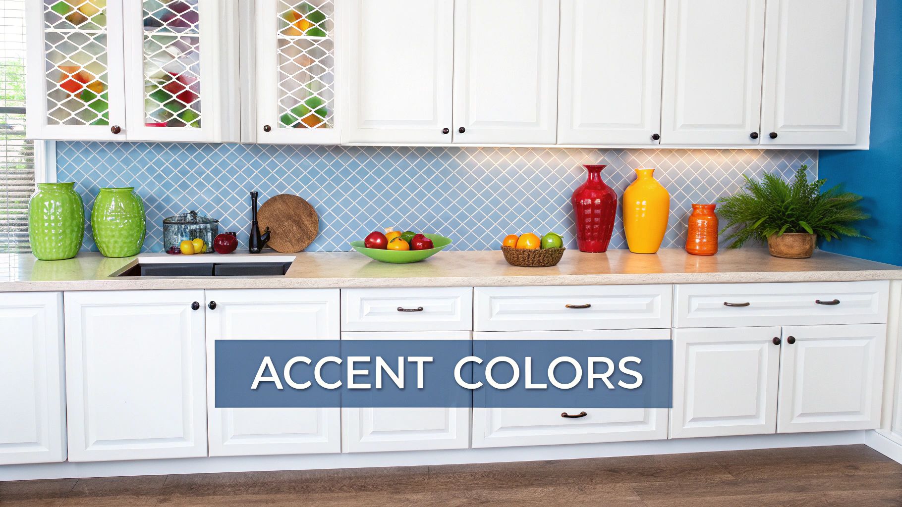
Embracing Energetic Jewel Tones
If you're after something with a bit more energy and a touch of luxury, let white be the grounding force for rich jewel tones. These heavily saturated colours can sometimes feel like a bit much on their own, but with white, they make a powerful, stylish statement.
Here are a few pairings that always make an impact:
- Emerald Green: When you put emerald green next to white, you get a look that feels lush, opulent, and almost like you've brought the outside in. It’s absolutely stunning on a feature wall or a plush velvet sofa.
- Sapphire Blue: This one is deeper and more intense than navy. Sapphire offers a regal, striking contrast that manages to feel both modern and timeless at the same time.
- Daring Magenta: For those who really want to go for it, magenta brings a playful, electric energy into a space. White is the key to stopping it from feeling chaotic, keeping the look fun and chic.
The real trick to working with bold colours is all about balance. Let that vibrant shade be the star—maybe on a feature wall or a big piece of furniture—and let white play the essential supporting role on the other walls, the trim, and in your decor.
This strategic approach is what makes the difference between a beautifully designed room and one that just feels visually cluttered. It ensures your space has bags of personality without feeling overwhelming.
Tying It All Together for a Cohesive Look
So, how do you pull all these ideas together? Figuring out what colour truly goes with white boils down to a few core principles that designers use time and time again.
The first, and most crucial, step is to identify the undertone of your white. Is it a crisp, cool white with blueish hints, or a creamy, warm white with yellow or beige undertones? Getting this right is the foundation for a harmonious space and prevents any awkward clashing down the line.
Once you have your base white sorted, it's all about building depth. You can create a rich, inviting room by layering different textures, even if you’re sticking to a simple palette. Think of a chunky knit blanket, a smooth linen cushion, and a rough-hewn wooden table—all against a white backdrop.
Accent colours are where you can really let your personality shine. Use them strategically to draw the eye and add a splash of energy. Accessories are brilliant for this; for example, learning how to use throws for corner sofas is a fantastic way to introduce these pops of colour without a huge commitment.
Finally, never underestimate the power of natural light. Watch how the light moves through your room during the day and see how it changes your chosen colours. It’s a vital consideration that can completely transform the feel of a space.
Taking this thoughtful approach ensures your room doesn’t just look decorated, but feels intentionally and beautifully designed. It’s a space that’s polished, welcoming, and completely your own.
Your Questions About Decorating With White, Answered
Working with a white palette is a fantastic starting point, but it often brings up a few common questions. Getting these details right is what separates a room that feels effortlessly chic from one that just falls a little flat. Let's tackle some of the most frequent queries I hear.
What’s The Best White Paint For A Dark Room?
If you're dealing with a room that's short on natural light, your best friend is a brilliant white paint with a high Light Reflectance Value (LRV). I always recommend looking for shades with neutral or even slightly warm undertones. These are pros at grabbing whatever light is available and bouncing it around the space, which instantly makes it feel brighter.
On the other hand, try to steer clear of cool whites with strong grey or blue undertones in these situations. Without enough light to balance them out, they can make a poorly lit room feel a bit gloomy and cold, rather than fresh and airy.
How Do I Stop A White Room Feeling Too Clinical?
This is a classic concern, but the solution is actually quite simple: layering textures and materials. When you bring in a variety of tactile surfaces, you create visual warmth and depth, completely transforming the feel of the space.
By combining different textures like wool, linen, and natural wood, you create a rich sensory experience that transforms a simple white room into a cosy, welcoming sanctuary.
Think about adding things like chunky wool throws, soft linen curtains, a plush rug underfoot, or a few pieces of natural wood furniture. Warm lighting from a few lamps and a couple of well-chosen houseplants can also make a world of difference, breathing life and personality into the room.
Is It Okay To Mix Different Shades Of White In One Room?
Absolutely! In fact, this is a brilliant technique that designers use all the time to give a room subtle depth and character. When you get it right, it creates a wonderfully layered, interesting look that feels intentional and thoughtfully put together.
The trick to making it work is to stick to whites from the same undertone family. So, pair your cool whites with other cool whites, and your warm whites with other warm ones. Another great tip is to play with different paint sheens for a subtle contrast – for example, using a matt finish on the walls and a soft satin on the trim.
Ready to give your sofa a fresh, new look that ties in perfectly with your white interior? Explore the stunning and versatile collection at The Sofa Cover Crafter and find the perfect cover to complete your space. Visit us at https://thesofacovercrafter.co.uk today.