


Your living room is the heart of your home, a space for relaxation, entertainment, and connection. The right colour scheme can transform its entire atmosphere, making it feel more spacious, cosy, or sophisticated. But with endless options, where do you begin? Choosing a palette is less about following strict rules and more about creating a feeling. Before diving into specific shades, it helps to understand the fundamentals of balance.
A well-organised room often follows the 60-30-10 principle: 60% for a dominant base colour (like your walls), 30% for a secondary colour (found in furniture and large textiles), and 10% for a vibrant accent (cushions, art, and decor). Consider your room's natural light, the mood you want to create, and your existing furniture. A simple refresh, like a new sofa cover or a set of cosy throws, can serve as the perfect starting point, anchoring your entire design.
This guide will walk you through 10 distinct living room colour scheme ideas, each complete with actionable tips to help you create a space you'll love. For more detailed advice and inspiration, you can also explore additional living room paint color ideas that cater to various styles and preferences. We’ll provide everything you need to confidently choose a palette and bring it to life.
1. Neutral Monochromatic
A neutral monochromatic scheme is a timeless and sophisticated choice for any living room. This approach uses varying shades, tints, and tones of a single neutral colour, such as grey, beige, taupe, or cream, to create a harmonious and calming atmosphere. The beauty of this living room colour scheme idea lies in its ability to make a space feel both cohesive and expensive without being visually overwhelming. It serves as a perfect canvas for your furniture, art, and personal touches to stand out.
How to Implement a Neutral Monochromatic Scheme
The key to preventing a monochromatic room from feeling flat is to layer diverse textures and materials.
- Vary Your Textures: Combine soft, cosy materials like wool and boucle with sleek surfaces like leather or metal. Think of a chunky knit throw on a linen sofa, a polished wood coffee table on a sisal rug, or velvet cushions against a matte painted wall.
- Play with Finishes: Mix matte and gloss finishes to add subtle depth. A matte wall colour can be contrasted with a silk-look cushion or a high-gloss ceramic lamp base.
- Strategic Lighting: Use lighting to highlight the different tones within your palette. An uplighter can accentuate the texture of a wall, while a well-placed table lamp can create a warm pool of light on a side table.
This scheme is ideal for creating a serene retreat, especially in spaces like minimalist Scandinavian-inspired rooms or high-end, hotel-like interiors. By layering shades from light to dark, you add dimension and prevent the look from becoming boring. This versatile approach also makes it easy to update your space with seasonal accents or a new piece of artwork. You can find more inspiration for your neutral-toned living room makeover and see how different fabrics and textures work together. Learn more about transforming your living room with neutral tones.
2. Warm Earth Tones
A warm earth tone scheme brings the grounding and comforting essence of nature into your living room. This palette uses colours drawn from natural landscapes, such as rich terracottas, warm browns, deep ochres, and burnt oranges. This living room colour scheme idea is perfect for creating an inviting, stable, and cosy atmosphere. It evokes a sense of connection to the outdoors, making the space feel both organic and sophisticated, reminiscent of Southwestern or Mediterranean-inspired interiors.
How to Implement a Warm Earth Tones Scheme
To master this look, focus on layering and balancing the warm hues with natural textures and materials.
- Balance with Neutrals: Use cream, beige, or off-white on walls or for larger furniture pieces to keep the warm colours from overpowering the room. This provides a clean backdrop that allows the richer earth tones to pop.
- Layer Tonal Shades: Create depth by layering different shades from the same family. For example, pair a deep brown sofa with terracotta cushions, an ochre throw, and a jute rug. This adds complexity and visual interest.
- Incorporate Natural Materials: Enhance the earthy feel by incorporating materials like wood, stone, clay, and woven fibres. A rustic wooden coffee table, ceramic vases, or a stone fireplace will complement the colour scheme beautifully.
This approach is ideal for anyone wanting to create a snug and welcoming sanctuary. The colours are inherently warm, making them perfect for promoting relaxation and comfort, especially in rooms that receive less natural light. By combining these rich hues with natural elements, you can design a space that feels both timeless and deeply connected to the natural world.
3. Cool Blue and Grey
A cool blue and grey palette offers a modern and serene living room colour scheme idea, creating a sophisticated and calming atmosphere. This combination pairs various shades of grey, from soft dove to deep charcoal, with a spectrum of blues, such as sky blue, steel blue, or rich navy. The result is a crisp, clean aesthetic that feels both tranquil and contemporary, reminiscent of coastal retreats or chic, urban spaces. This versatile pairing provides a backdrop that is calming yet full of character.
How to Implement a Cool Blue and Grey Scheme
The key to this scheme is balancing the cool tones to ensure the space feels inviting rather than cold.
- Introduce Warmth with Accents: Prevent the room from feeling too clinical by incorporating warm metallics. Brass or gold accessories like lamp bases, picture frames, or decorative objects can provide a beautiful contrast.
- Incorporate Natural Textures: Add natural wood elements through furniture, such as an oak coffee table or shelving, to bring organic warmth and texture into the room. A jute or sisal rug can also help ground the cool palette.
- Balance with Art and Textiles: Use artwork or textiles that feature warmer tones. A cushion with a splash of terracotta or a piece of art with hints of mustard yellow can create a perfect visual balance without disrupting the overall scheme.
This colour combination is ideal for creating a peaceful haven, perfect for contemporary apartments, minimalist Scandinavian interiors, or modern coastal-inspired homes. The interplay between blue and grey offers significant depth, while the addition of warm elements ensures the environment remains welcoming and cosy. It’s a timeless choice that adapts well to changing seasons and decor updates.
4. Jewel Tones
A jewel-toned scheme infuses a living room with opulence, drama, and personality. This luxurious approach uses rich, saturated colours inspired by precious gems: emerald green, sapphire blue, amethyst purple, and ruby red. This bold living room colour scheme idea is perfect for creating sophisticated, glamorous spaces with incredible depth and character. It moves beyond standard palettes to craft an environment that feels both curated and daring, making a powerful style statement.
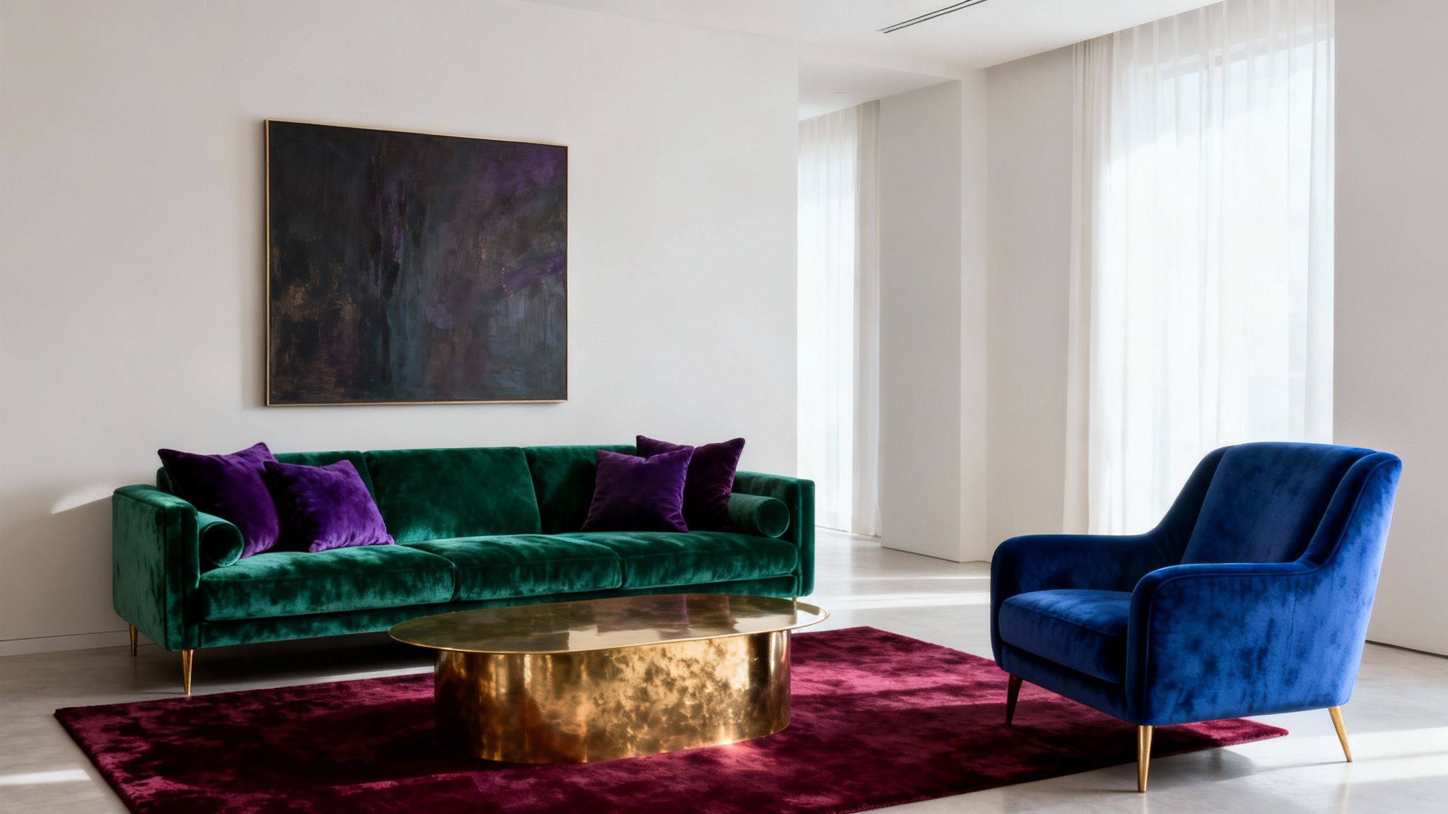
How to Implement a Jewel-Toned Scheme
The secret to mastering jewel tones is to balance their intensity with complementary neutrals and luxurious textures.
- Balance with Neutrals: Pair a rich sapphire wall or an emerald green sofa with furniture in softer shades like grey, cream, or charcoal. This prevents the vibrant colours from overwhelming the space and allows them to take centre stage.
- Introduce Metallics: Gold, brass, and bronze accessories are the perfect partners for jewel tones. They reflect light and enhance the palette’s inherent glamour. Think of a gold-framed mirror, brass light fixtures, or a polished coffee table.
- Layer Rich Textiles: Embrace materials with a natural lustre that complements the gem-like colours. Velvet is a classic choice for sofas and cushions, while silk or satin curtains can add another layer of elegance.
This scheme is ideal for making a memorable impression, often seen in Art Deco-inspired interiors or modern maximalist designs. Even in smaller quantities, such as through a statement armchair or a collection of cushions, jewel tones can completely transform a room. For a custom look, you can explore creative techniques for your textiles. Discover more about achieving custom rich colours for your sofa fabrics.
5. Black and White with Grey
A black, white, and grey scheme delivers timeless sophistication and high-impact contrast. This classic palette creates a modern, clean, and structured feel, drawing on the crisp definition between light and dark. One of the most versatile living room colour scheme ideas, it can be adapted for everything from stark minimalist lofts to more layered, cosy contemporary spaces. This scheme provides a powerful foundation that allows architectural details and curated decor to take centre stage.
How to Implement a Black, White, and Grey Scheme
The success of this high-contrast palette lies in balancing its core elements and introducing texture to add warmth and depth.
- Layer Shades of Grey: Use various shades of grey to bridge the gap between black and white. A charcoal sofa, light grey walls, and mid-grey cushions create a sophisticated, layered effect that softens the overall look and prevents it from feeling too stark.
- Introduce Natural Textures: Prevent the scheme from feeling cold by incorporating natural materials. A warm-toned wooden coffee table, a jute or sisal rug, or even some indoor plants can add organic warmth and texture that balances the crispness of the monochrome.
- Play with Patterns: Use geometric patterns in black and white to add visual interest without introducing new colours. Think of a bold striped rug, chevron-patterned cushions, or abstract wall art to create dynamic focal points within the room.
This approach is perfect for creating a chic and modern living area that feels both organised and effortlessly stylish. It's a forgiving palette that allows for easy updates; a single accent colour, like a pop of mustard yellow or emerald green, can be introduced through accessories for a quick seasonal refresh. By carefully balancing light, dark, and texture, you can create a space that is both dramatic and inviting.
6. Sage Green and Warm Neutrals
Inspired by nature, a sage green and warm neutral palette creates a calming, balanced atmosphere in any living room. This organic scheme combines the gentle, earthy tones of sage with the softness of cream, beige, and light tan. This sophisticated living room colour scheme idea bridges the gap between cool and warm tones, resulting in a tranquil space that feels both grounded and refreshing. It's an ideal backdrop for biophilic design elements, such as natural wood and houseplants.
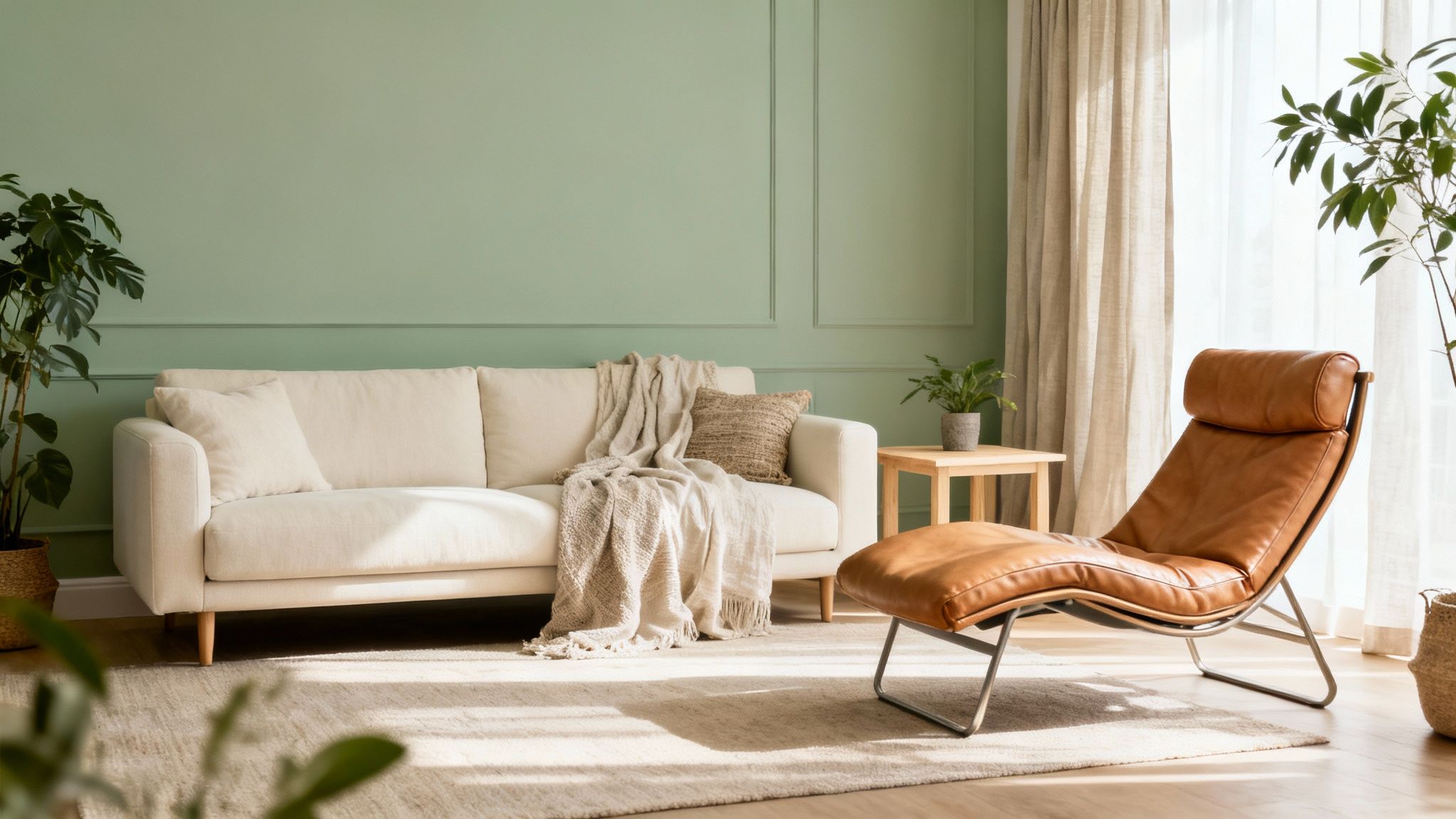
How to Implement a Sage Green and Warm Neutrals Scheme
The goal is to create a serene environment that feels connected to the outdoors, using texture and natural materials to enhance the palette.
- Balance with Neutrals: Use a soft, muted sage green as an accent wall or for key furnishings like a sofa, and balance it with plenty of warm neutrals. Walls painted in ivory or cream will make the sage green feel intentional and not overpowering.
- Incorporate Natural Textures: Layer materials like linen, jute, rattan, and light-toned wood. A jute rug, a wooden coffee table, or linen cushion covers will reinforce the scheme’s organic, earthy feel and add visual interest.
- Introduce Greenery: Enhance the biophilic connection by adding live plants. The vibrant green of houseplants will complement the muted sage tones and bring life and fresh energy into the room.
This colour scheme is perfect for creating a peaceful sanctuary, suiting modern farmhouse, Scandinavian, or contemporary wellness-focused interiors. It promotes a sense of calm and well-being, making your living room a true retreat from the outside world. The palette is versatile enough to be styled for any season, feeling fresh in spring and cosy in autumn.
7. Rich Burgundy and Gold
A rich burgundy and gold scheme brings a sense of opulence and sophistication to any living room. This combination pairs deep, wine-like burgundy with the warm, metallic lustre of gold, creating an atmosphere that is both dramatic and inviting. This powerful living room colour scheme idea is perfect for crafting a formal, luxurious space that feels established and timeless. It works beautifully in traditional settings but can be adapted for a bold, contemporary look.
How to Implement a Rich Burgundy and Gold Scheme
The key to this palette is achieving balance to prevent the space from feeling too heavy or dated.
- Balance with Neutrals: Use cream, ivory, or soft grey on larger surfaces like walls or a main sofa to provide a bright contrast to the deep burgundy. This keeps the room feeling open and allows the richer colours to stand out without overwhelming the space.
- Incorporate Gold Thoughtfully: Introduce gold through metallic accents rather than large-scale applications. Think light fixtures, mirror frames, curtain rods, and the legs of a coffee table or armchair. These touches will catch the light and add a layer of glamour.
- Layer Rich Textures: Enhance the luxurious feel with sumptuous materials. A velvet burgundy sofa or cushions, silk-look curtains, and a plush rug can be paired with the sleek, hard surface of gold or brass accessories to create a dynamic and tactile environment.
This scheme is ideal for creating a warm, stately retreat, reminiscent of a classic library or an exclusive lounge. By using burgundy as an accent wall or on key furniture pieces, you can inject personality and depth. Warm lighting is crucial here; it will make the gold accents glow and deepen the richness of the burgundy, ensuring the room feels welcoming and grand.
8. Warm White and Natural Wood
Pairing warm white with natural wood is an organic and refreshing living room colour scheme idea that creates an inviting, airy atmosphere. This approach centres on using soft, warm whites or creams for the walls, providing a clean backdrop that enhances the natural beauty and texture of wood. The resulting space feels both bright and grounded, drawing inspiration from Scandinavian and Japanese minimalist design to foster a sense of calm and connection to nature.
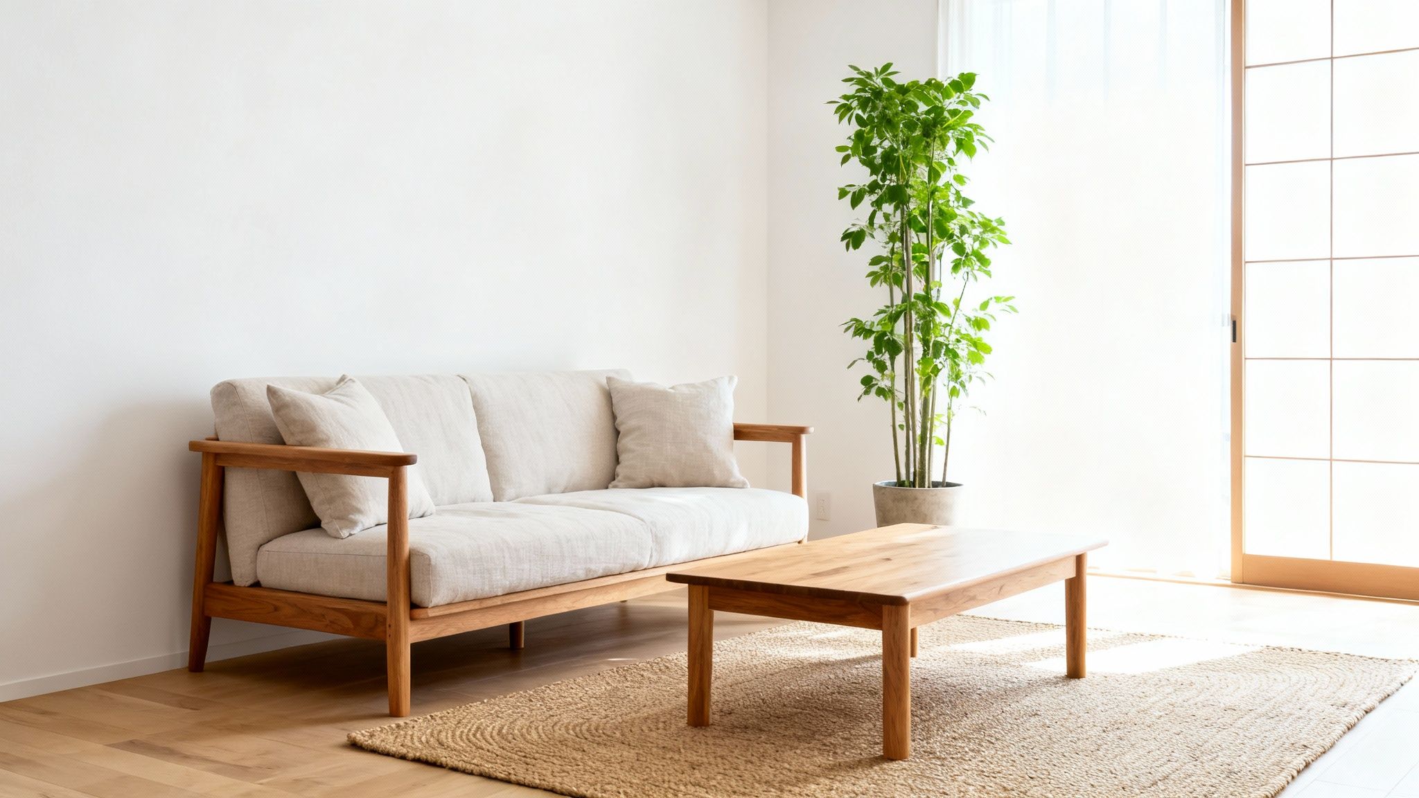
How to Implement a Warm White and Natural Wood Scheme
To make this simple palette feel rich and intentional, focus on layering materials and celebrating the details of natural elements.
- Choose the Right White: Opt for a creamy off-white or a white with warm undertones rather than a stark, cool white. This prevents the room from feeling clinical and enhances the warmth of the wood.
- Mix Your Wood Tones: Don't be afraid to use a variety of wood finishes, from light oak and ash to richer walnut or teak. Combining different tones adds depth and prevents the scheme from appearing one-dimensional.
- Layer Natural Textures: Introduce other natural materials to build on the organic feel. Think of linen curtains, a jute or sisal rug, woven baskets, or a stone-topped coffee table. A few well-placed plants will also bring life and colour to the space.
This scheme is perfect for those wanting to create a serene, light-filled sanctuary that feels clean yet cosy. It’s highly versatile and works beautifully in modern farmhouse, Japandi, and contemporary interiors. You can discover more about which colours to pair with a white base to complement this timeless look.
9. Blush Pink and Soft Metallics
A blush pink and soft metallics scheme brings a delicate, contemporary warmth to a living room. This sophisticated palette pairs soft, muted pinks with the gentle lustre of rose gold, copper, or brushed brass. Far from being overly sweet, this combination creates a refined and modern atmosphere that feels both welcoming and chic. It's an excellent living room colour scheme idea for crafting a space that is romantic, calming, and effortlessly stylish, balancing feminine softness with grown-up glamour.
How to Implement a Blush Pink and Soft Metallics Scheme
The success of this palette lies in its balance and the careful selection of tones and finishes.
- Choose the Right Pink: Opt for muted, dusty, or blush pinks rather than bright fuchsia. Use it on an accent wall, a statement sofa, or through soft furnishings like cushions and throws.
- Balance with Neutrals: Ground the pink tones with a foundation of soft whites, light greys, or creamy beiges. This prevents the pink from overwhelming the space and maintains a sophisticated feel.
- Layer Metallic Accents: Introduce rose gold, copper, or brass through light fixtures, mirror frames, table legs, and decorative accessories. Mix finishes, such as matte and polished, for added visual interest.
This scheme is perfect for modern interiors, adding a touch of luxe and personality without sacrificing a clean aesthetic. By pairing the soft colours with hard materials like marble or polished concrete, you can create a beautiful textural contrast. The metallic elements reflect light, helping to make the room feel brighter and more dynamic, while the blush tones provide a soothing, gentle backdrop.
10. Terracotta and Teal
Pairing warm, earthy terracotta with the cool, refreshing tones of teal creates a vibrant and beautifully balanced living room colour scheme. This dynamic combination bridges warm and cool colour families, resulting in an energetic space with a distinct global or eclectic appeal. The richness of terracotta provides a grounding, cosy foundation, while teal injects a pop of invigorating colour, making the room feel both inviting and sophisticated. This pairing is perfect for those looking to create a space with character and worldly charm.
How to Implement a Terracotta and Teal Scheme
The key to mastering this bold duo is to strike the right balance and use a neutral colour to prevent visual overload.
- Follow the 60-30-10 Rule: Use terracotta as the dominant colour for walls or large furniture pieces (60%). Introduce a calming neutral like cream or soft grey for larger textiles like rugs or curtains (30%). Finally, use teal as your accent colour for cushions, artwork, or decorative objects (10%).
- Embrace Natural Materials: Complement this earthy palette with natural textures. Think wooden furniture, clay pottery, woven baskets, and linen throws to enhance the organic feel of the scheme.
- Use Patterned Textiles: Introduce textiles like rugs, cushions, or throws that feature both terracotta and teal in a single pattern. This is a brilliant way to tie the entire colour scheme together cohesively.
This living room colour scheme idea works exceptionally well in contemporary bohemian, Southwestern-inspired, or modern Mediterranean interiors. It allows for a creative and expressive space that feels both curated and comfortable, making it a fantastic choice for a family living room or a creative's personal sanctuary. The contrast between the two main colours adds depth and visual interest without overwhelming the senses.
Top 10 Living Room Colour Scheme Comparison
| Style | 🔄 Implementation complexity | ⚡ Resource requirements | ⭐ Expected outcomes | 📊 Ideal use cases | 💡 Key advantages |
|---|---|---|---|---|---|
| Neutral Monochromatic | Low — one colour family; texture needed | Low–Moderate — varied textiles & lighting | Calm, cohesive, timeless ⭐⭐⭐⭐ | Small spaces, minimalist, hotel lobbies, art backdrops | Versatile; easy to refresh; enhances light |
| Warm Earth Tones | Medium — balance warm shades carefully | Moderate — natural materials, warm lighting | Inviting, grounded, cosy ⭐⭐⭐⭐ | Family rooms, farmhouse, Mediterranean, boho | Comfortable; pairs with wood; biophilic warmth |
| Cool Blue and Grey | Medium — avoid overly cold feel | Moderate — lighting, metallic or wood accents | Serene, sophisticated, spacious ⭐⭐⭐⭐ | Coastal, contemporary, bedrooms, offices | Relaxing; enhances light; pairs with metals |
| Jewel Tones | High — bold use & lighting design required | High — rich fabrics, strong lighting, metallics | Dramatic, luxurious, high-impact ⭐⭐⭐⭐⭐ | Formal living, hotels, accent walls, maximalist spaces | Memorable focal points; elegant; richly textured |
| Black and White with Grey | Medium — manage high contrast carefully | Low–Moderate — quality finishes, lighting | Striking, modern, versatile ⭐⭐⭐⭐ | Minimalist lofts, galleries, fashion-forward homes | Timeless; easy to update; strong graphic impact |
| Sage Green and Warm Neutrals | Low–Medium — choose muted sage, balance tones | Moderate — plants, natural textiles, wood | Calming, balanced, wellness-focused ⭐⭐⭐⭐ | Wellness spaces, modern farmhouse, spa-like rooms | Biophilic; pairs with plants & wood; timeless trend |
| Rich Burgundy and Gold | High — needs balance to avoid heaviness | High — luxe textiles, metallic fixtures, lighting | Opulent, intimate, formal ⭐⭐⭐⭐ | Libraries, formal dining, luxury hospitality | Luxurious; glamorous; excellent for evening settings |
| Warm White and Natural Wood | Low — straightforward, needs quality materials | Moderate — good wood selection, natural fibers | Bright, airy, natural ⭐⭐⭐⭐ | Scandinavian/Japanese minimalism, kitchens, small rooms | Versatile; brightens small spaces; highlights craft |
| Blush Pink and Soft Metallics | Medium — avoid overtly feminine or dated look | Moderate — metallic fixtures, refined textiles | Soft, modern, refined ⭐⭐⭐ | Bedrooms, boutique apartments, feminine-forward spaces | Contemporary warmth; flattering; subtle luxe |
| Terracotta and Teal | High — confident colour coordination required | Moderate — terracotta materials, accent pieces | Energetic, balanced, eclectic ⭐⭐⭐⭐ | Bohemian, southwestern, eclectic living rooms | Dynamic contrast; worldly appeal; energizing |
Bring Your Colour Scheme to Life
Choosing your ideal palette is the exciting first step, but the real transformation begins when you translate that vision into a tangible, inviting space. We’ve explored a diverse range of living room colour scheme ideas, from the serene simplicity of Warm White and Natural Wood to the dramatic elegance of Rich Burgundy and Gold. Each scheme offers a unique atmosphere, yet they all share a common principle: successful execution hinges on the thoughtful application of colour across walls, textiles, and decor.
Your chosen colours are more than just a background; they are the foundation of your room’s personality. The key takeaway is that a cohesive living room is built through layers. Start with your dominant wall colour, which sets the overall mood. Whether you're tackling the project yourself or overseeing professionals, understanding how to paint interior walls is fundamental to achieving a polished finish for your chosen living room colour scheme. From there, introduce your secondary and accent colours through key furnishings and decorative pieces.
Actionable Steps to Finalise Your Design
Now that you're armed with inspiration, it’s time to move from concept to reality. Follow these final steps to bring your vision together seamlessly:
- Create a Mood Board: Gather physical or digital samples of your chosen paint colours, fabric swatches for sofas and curtains, and images of furniture and accessories. This visual reference ensures every element works in harmony before you commit.
- Test Your Colours: Always test paint samples on your walls. Observe how they look at different times of the day, as natural and artificial light can dramatically alter their appearance.
- Anchor with Your Sofa: Your sofa is often the room's focal point. Instead of a costly replacement, an expertly chosen sofa cover can become the central piece that anchors your entire colour scheme. A deep teal cover can ground a terracotta palette, while a soft cream cover is the perfect base for a Sage Green and Warm Neutrals look.
Mastering these concepts allows you to create a space that not only looks professionally designed but also feels uniquely yours. A well-executed colour scheme elevates your home from a simple living space to a personal sanctuary, reflecting your style and enhancing your daily life. The right palette can make a small room feel spacious, a dark room feel brighter, and a house feel like a home.
Ready to take the final, transformative step? A stylish, washable sofa cover from The Sofa Cover Crafter is the most affordable and impactful way to anchor your new design. Explore our extensive collection at The Sofa Cover Crafter to find the perfect colour and texture that ties your entire living room together.